

A Bold New Identity for Southern Cape Christian School
Southern Cape Christian School needed a fresh start—a complete rebrand from Cape Christian Academy that would unite their community and establish a strong, cohesive identity across academics and athletics
About the Client
Southern Cape Christian School is a private Christian institution serving students from preschool through high school in Southern Cape, providing faith-based education rooted in community values and academic excellence. Their community includes students, families, staff, and alumni who value tradition, character development, and a strong sense of belonging.
The Challenge
The school was undergoing a complete transformation—rebranding from Cape Christian Academy to Southern Cape Christian School. After years of history under the original name, they needed an entirely new visual identity that would unite the community, establish credibility, and mark this fresh chapter. With no existing brand system in place, the school needed everything from scratch: a primary logo, athletic branding, and a cohesive visual system that could work across uniforms, signage, documents, and digital platforms.
Client
Southern Cape Christian School
My Role:
I led the complete brand development process, from concept to final delivery—designing a custom lion mascot, primary logo system, and comprehensive brand guidelines that would establish Southern Cape Christian School's new identity and bring unity across academic and athletic programs.
Deliverables:
Primary logo with integrated cross
Custom lion mascot illustration
Secondary logo variations
Typography and color system
Badge/emblem designs
Brand style guide
Skills Applied:
Brand Identity Design
Logo Design
Illustration
Typography

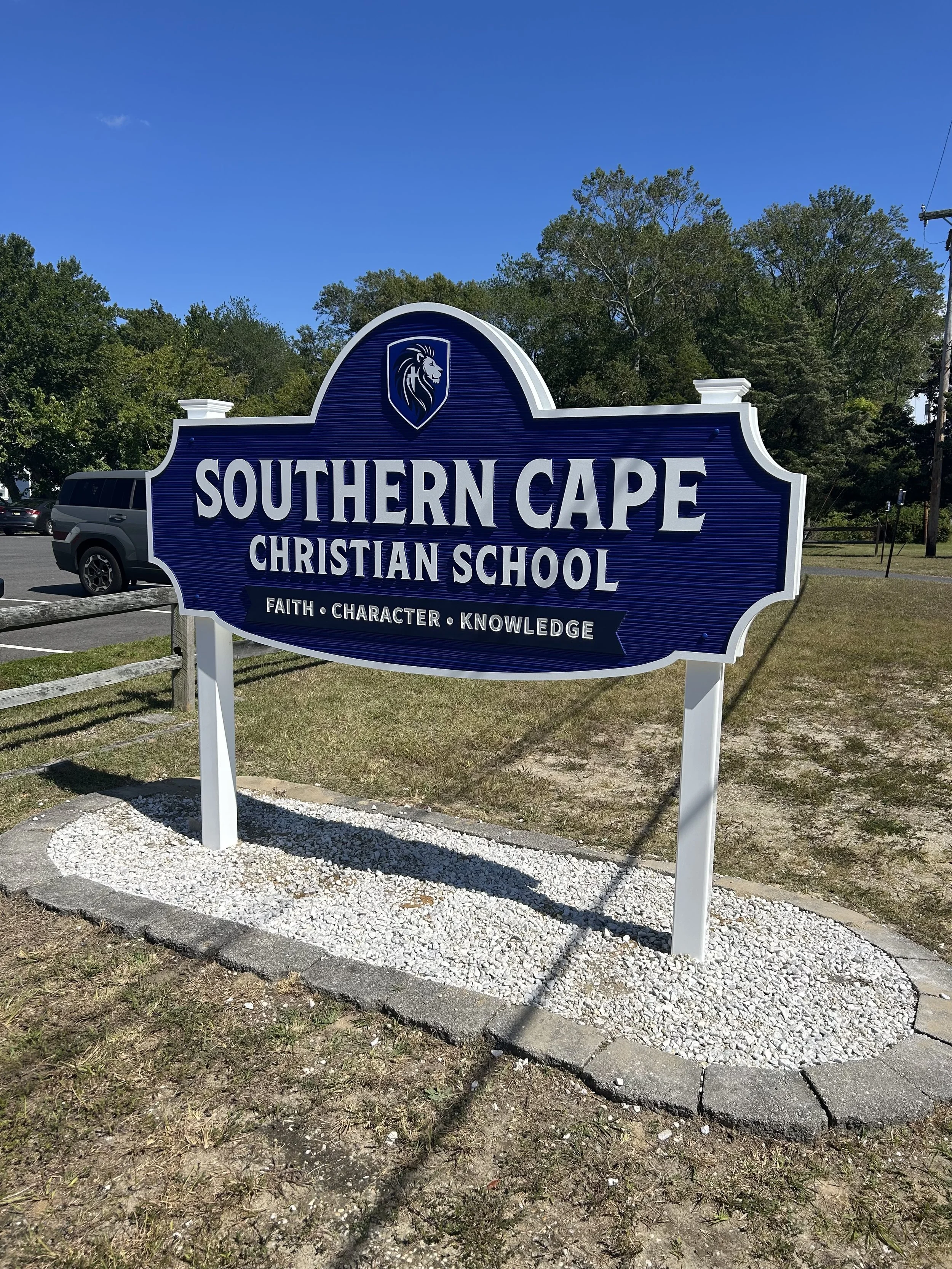
Primary Logo Design
The primary logo for Southern Cape Christian School was designed to balance tradition with strength. Featuring a classic serif typeface and a bold cross integrated into the letterforms, the logo reflects the school's foundational values while maintaining a clean, academic look. The goal was to create a mark that feels both timeless and versatile—equally at home on formal documents and student apparel.


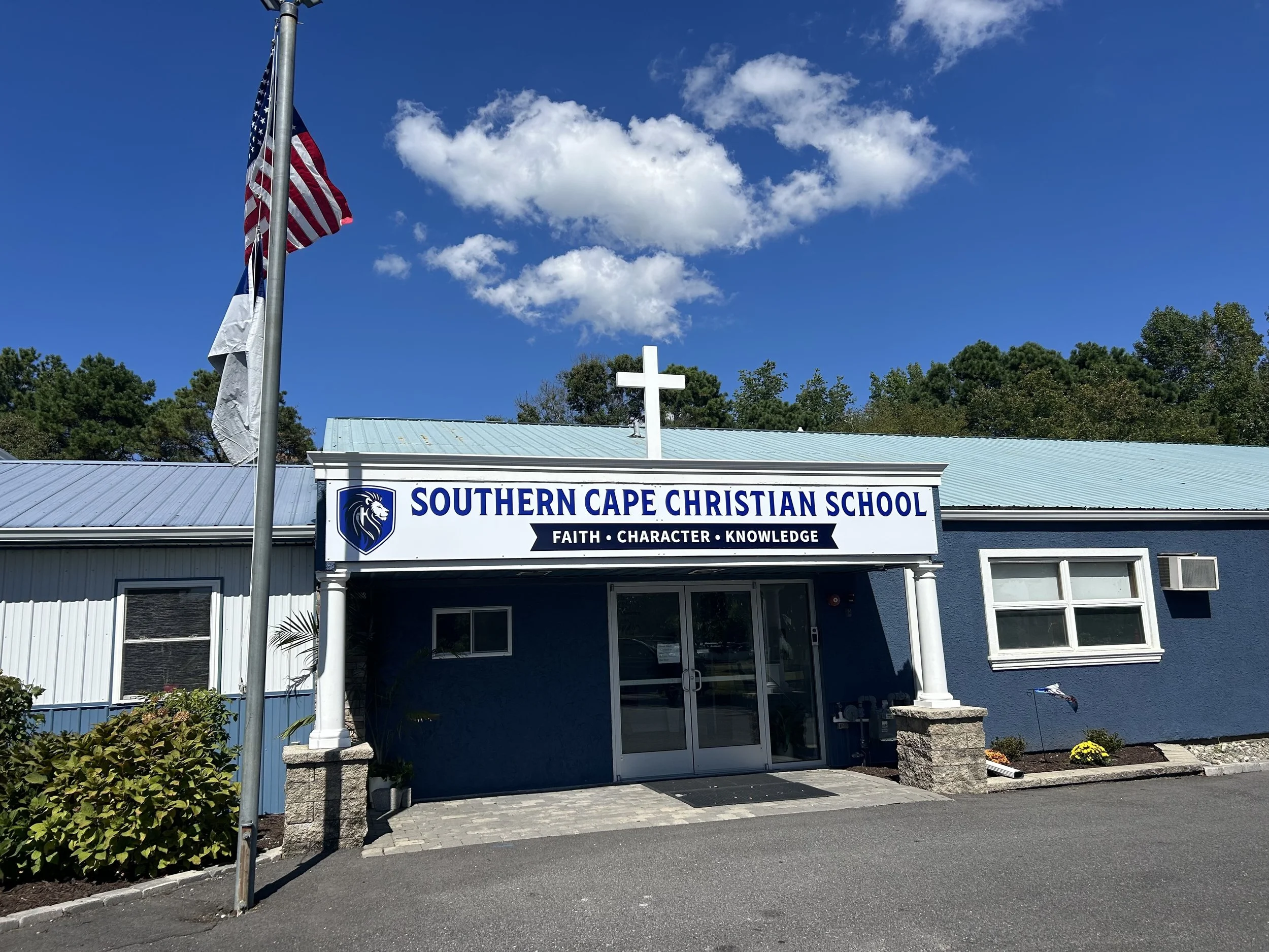
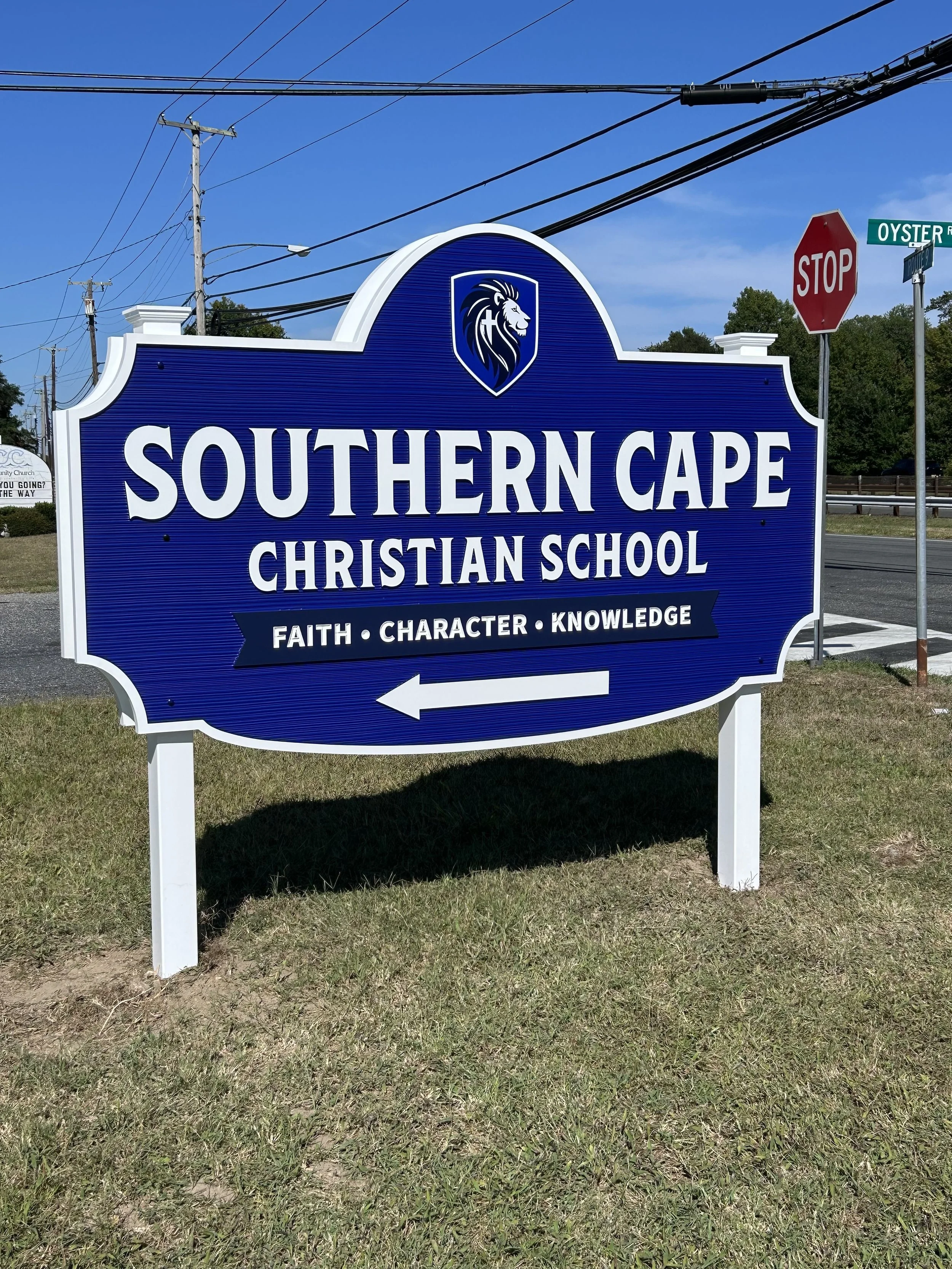
A Fresh Look for the School Grounds
The new logo is a part of the school’s everyday environment. From the main entrance to the building itself, Southern Cape Christian School now greets students, staff, and families with a consistent identity that feels both welcoming and professional. The refreshed look creates a strong first impression and reflects the pride of the school community each time you arrive.


Athletic Mascot Design
The lion mascot was created as a bold, energetic emblem for Southern Cape’s athletic teams. With clean lines and a confident expression, the illustration strikes a balance between approachability and strength—designed to inspire school spirit across uniforms, merchandise, and sports signage. The simplified, scalable design ensures it holds up in both large-format applications and embroidery.